A new network diagram function has been added to Heurist that allows you to view the schema of relationships within the database, as well as the network of connections between the records in a search result set. It also allows export of network data to GEPHI for further manipulation.
The new tool is a good way for researchers to explore and understand their data structure and content visually. By dragging nodes into position and interactively modifying the shape and colours of the diagram elements, a researcher can sometimes reveal hidden properties and patterns or isolate anomalies within the data. Clicking on either the nodes or the lines pops up information on the connectivity between them (pointer fields, relationships, counts).
Schema Structure
The Data Summary function uses a network diagram to display an interactive visualisation of the record relationships schema, that is the structure defined by pointer fields and relationships specified through relationship marker fields. These fields constrain the target record types and thus define the relationships structure of the database.
The Summary table on the left is a useful overview of the counts for each record type, and can be used to open a new tab with a search for a specific record type. Record types displayed in the network diagram can be turned on and off; the diagram remembers the selected record types and their position in the diagram between uses, so that the diagram is re-displayed the way you left it.
The direction of relationships between entities (record types) is shown with arrows, and the frequency of occurrence in the database is indicated by line thickness, which may be weighted to linear or log scales. The frequency of occurrence of each record type is shown by the radius of the node, which may also be linear or log scaled.
The nodes representing record types can be dragged to restructure the diagram; with gravity enabled, other nodes will settle into position.
Settings include line thickness, node radius and colours, and ‘gravity’ settings (which govern how the diagram behaves when entities are moved). There’s also a fisheye mode, mostly just for fun. Setting curved lines allows one to separately view relationships which go in opposite directions, which would otherwise appear as a single line with arrows in both directions.
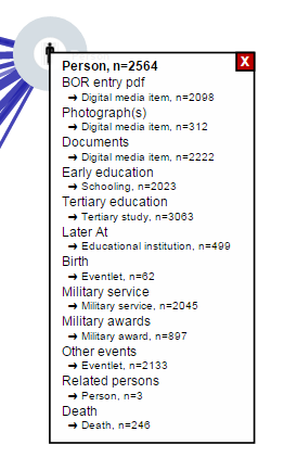
You can view information about a particular record type (pointer and relationship marker fields, with use counts) by clicking on a node.

Data Visualisation
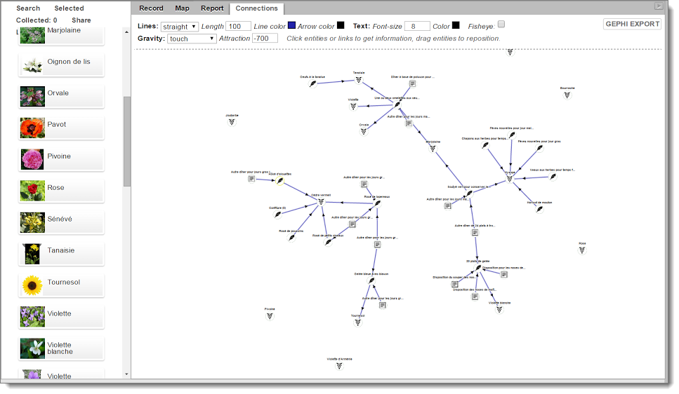
Network visualisation is also available through the “Connections” tab in the righthand panel of the search screen. This diagram shows the records in the current result-set as nodes, and the connections (pointer fields and relationships) as the lines between nodes (edges).
This diagram provides the same controls as the database schema diagram.
Gephi Export
For both types of diagram you can export the data to a Gephi GEFX file via the Gephi button at top-right.
Gephi is a widely used free, open-source desktop tool that gives great flexibility in the visualisation of networks. Further information and download of Gephi is available here.
Once you have installed Gephi, clicking on the exported Gephi file will open the data in Gephi, where you have a wide range of options for tailoring and exporting similar diagrams.


