
Tutorial 7 | The Publish Menu
Heurist is not merely a databasing or data management tool. It is also a fully-featured data publishing tool. Using the Publish menu, you can build a website to provide public access to your database, or export your data in several useful formats (e.g. as a spreadsheet, as an xml document, or as a robust archive package for your institutional repository or personal backup).
Create a Heurist database (free institutionally-supported services)
These free services are kindly supported by Intersect Australia, Huma-Num (France) and contributions from users.
To begin, watch the video. For more detailed instructions, you can consult the walkthrough. To learn something else, see our full list of tutorials.
- Step 1: Create A Website
- Step 2: Format Your Website: The Box Model
- Step 3: Add Interactive Content: Heurist Widgets
Creating A New Website
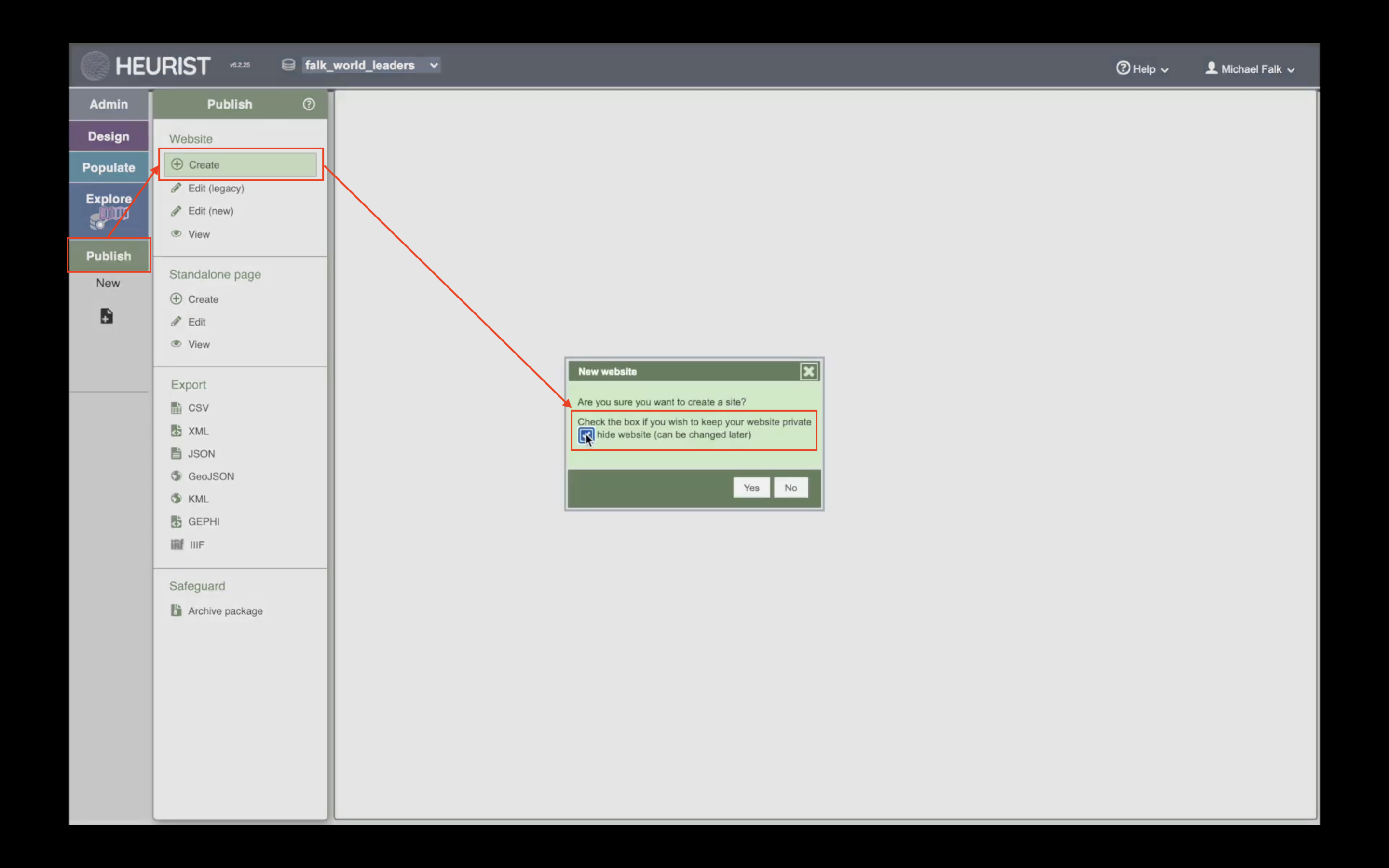
In the Publish menu, click ‘Create’ to create a new website. You can create as many websites as you like from your database. Many Heurist users do so, such as the researchers on the Expert Nation nation project, who ran several smaller projects on the wartime service of Australian university students on a single central database.
When you Create a new site, you will be asked whether to make it public or private. Many users prefer to have a private website until they are ready to show it to the world.
If you ever wish to View one of your websites in the way the public will see it, you can click ‘View’ in the top left of the Publish menu.
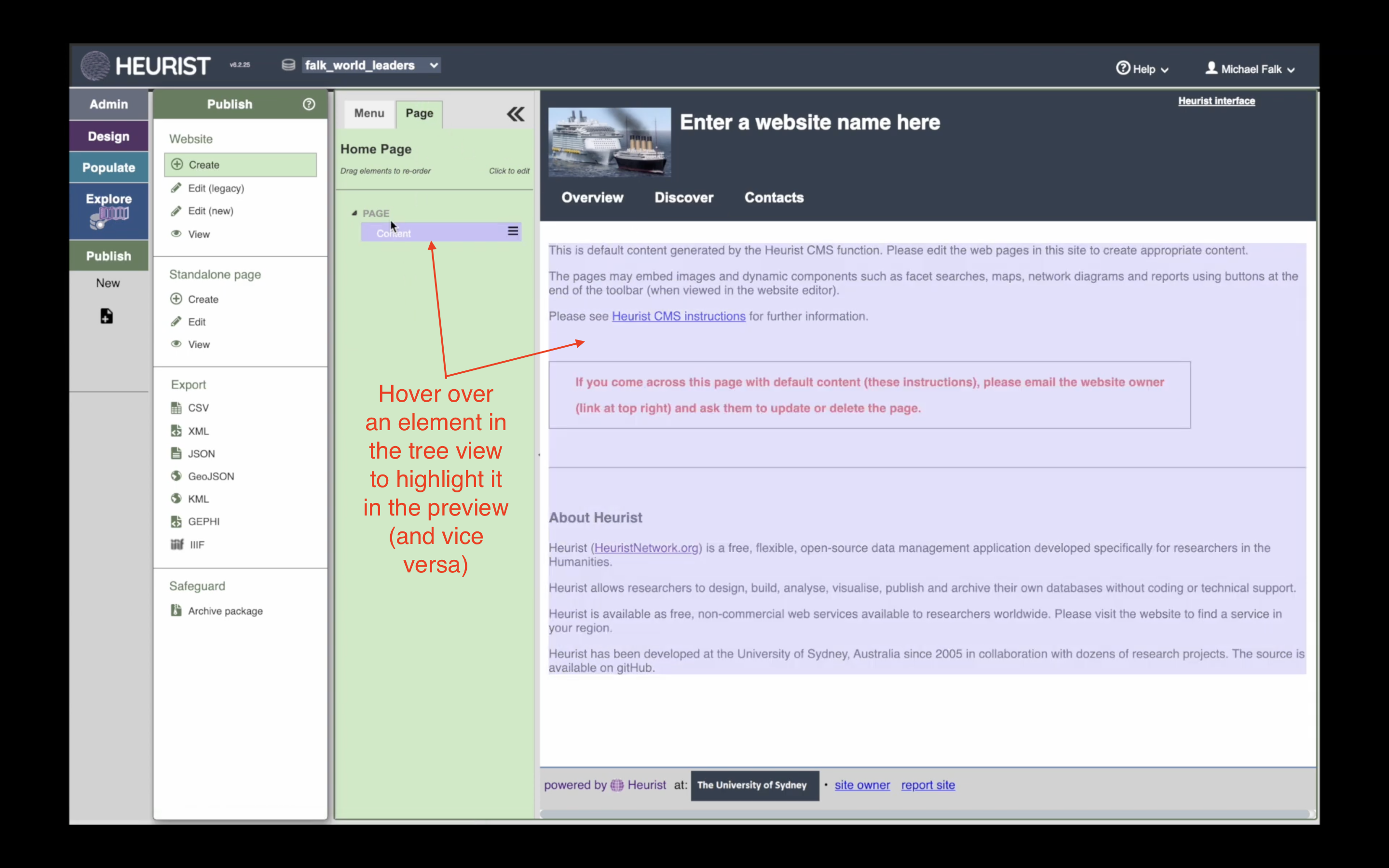
Once you have created your website, it will appear onscreen as a ‘treeview’ and a ‘preview’.
In the ‘treeview’ to the left, you can view information about the structure of the current page. In the ‘preview’ to the right, you can see a live version of the page. If you hover over an element of the page in either the ‘treeview’ or the ‘preview’, it will light up in both places.
Add a New Page to Your Site
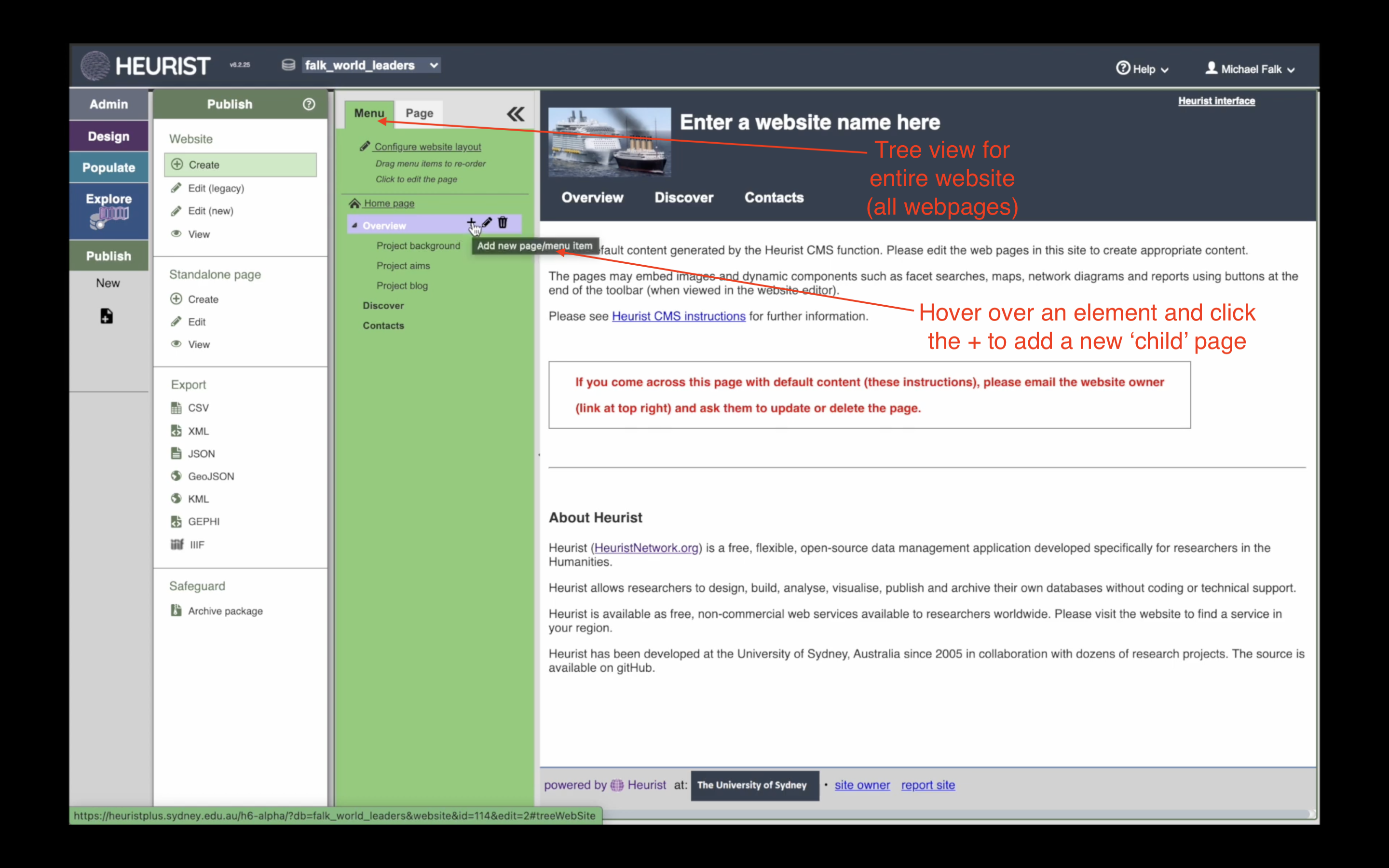
To add a new page to your site, click the ‘Menu’ tab in the ‘treeview’ to the left. This will bring up the ‘treeview’ for your entire website. You will see a list of all the pages in the website, some of which are nested under others. This list of pages is used to generate the menu buttons at the top of your webpage.
When you create a new Heurist website, we create a number of template webpages for you, such as ‘Project Background’, ‘Discover’ and ‘Content’. You may wish to use these pages as a framework, but you are free to rename, reorganise or remove them from the site as you wish.
You can also add entirely new pages to the site. In the example from the tutorial, I create a new page nested under the ‘Overview’ page. To do this, hover over ‘Overview’ in the treeview of the website, and click the ‘+’ icon.
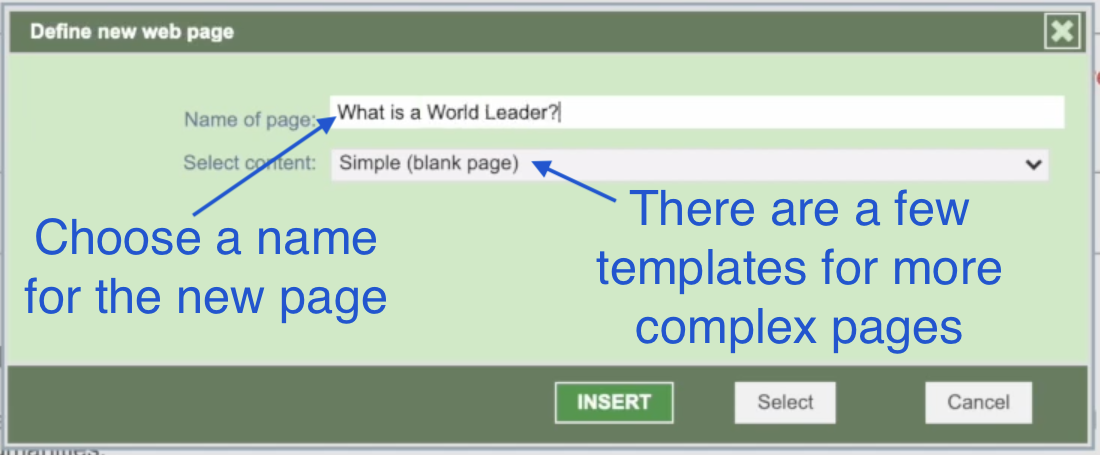
In the popup, you can choose a name for your site. We also provide some additional templates for more complex page layouts (e.g. for a blog page or a discover page). In the tutorial, I create a ‘Simple (blank) page’:
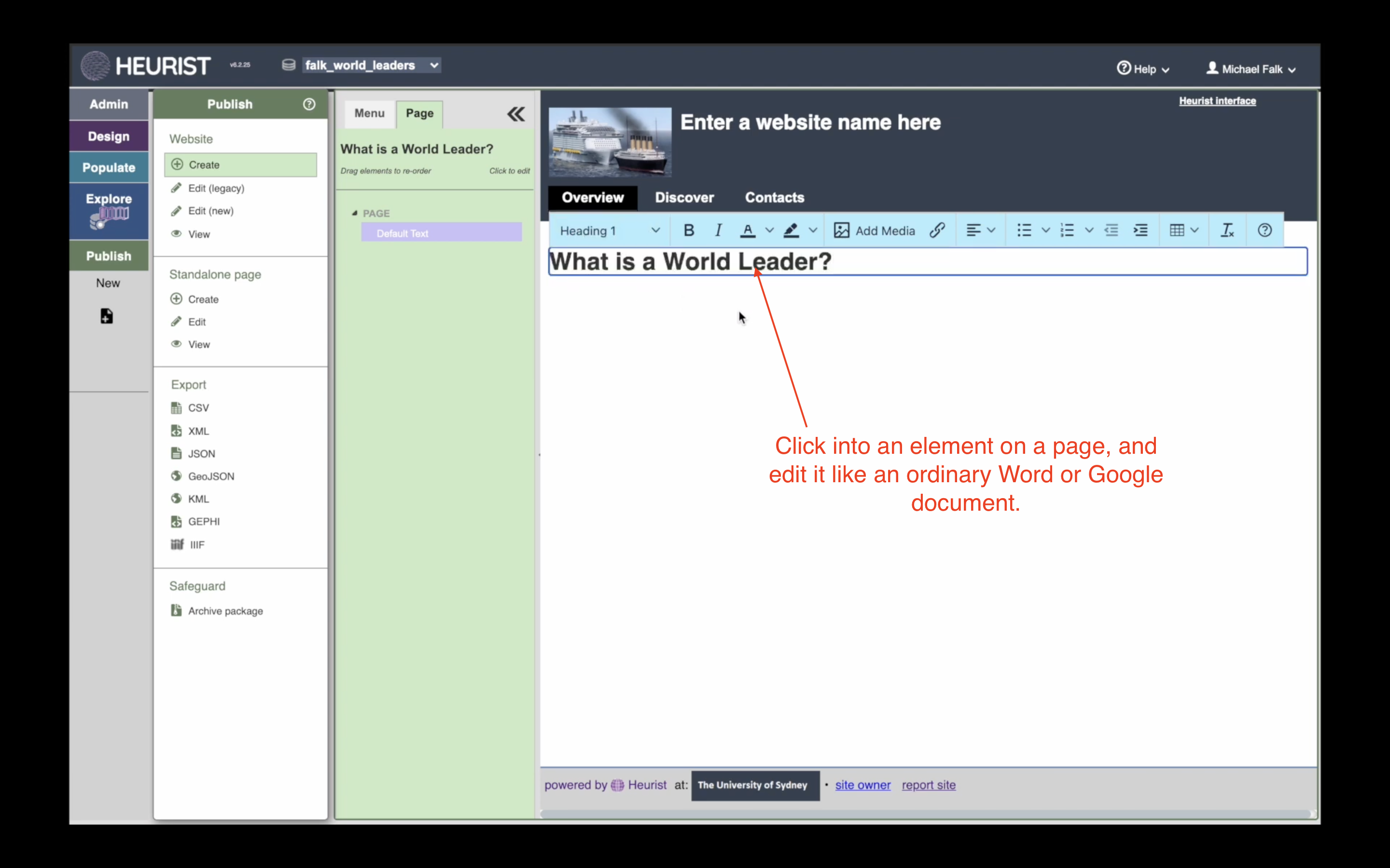
Edit Your New Page
When you create your new page, you will be taken to it straight away. To start editing it, simply click on the part of the page you wish to edit in the ‘preview’, and start typing as you would a Word or Google document. You will be prompted to save your work if you make any changes.
Change Website Settings
If you wish to edit settings for the website as a whole, you can do so under the ‘Menu’ tab in the ‘treeview’. The website settings give you great control over the look and feel of your entire website. In the tutorial, I demonstrate the two most basic settings: giving your website a title and a logo. But as you become more skilled in Heurist’s website builder, you can make even further adjustments, such as:
- Make a private website public
- Change the site’s colour scheme
- Change the behaviour of individual pages (e.g. do you want pages to display the page title as a heading at the top of the page?)
- Create a custom header or footer with different information
- Create your own CSS template with custom fonts or layouts
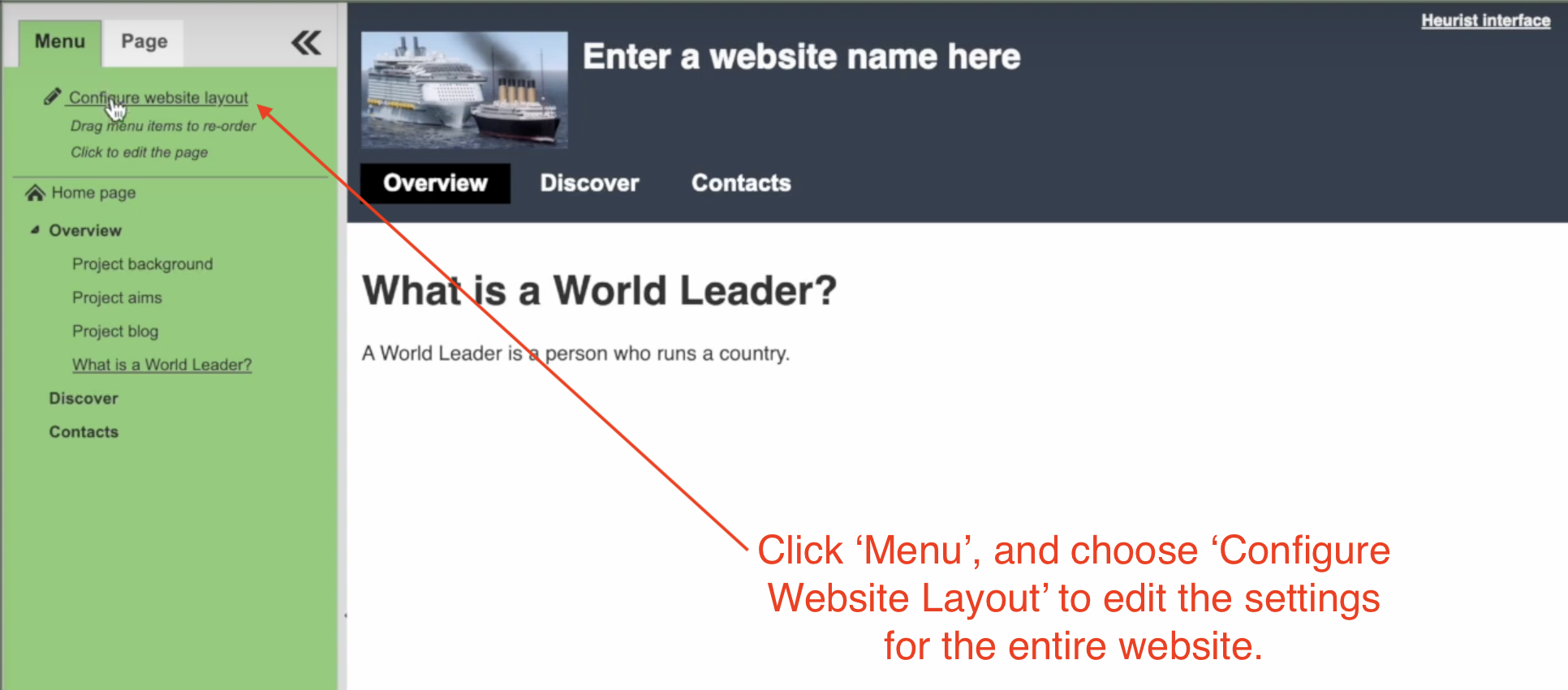
In the simple case, however, you can simple stay on the first tab of the ‘settings’ screen, where you can type a new site title and upload a new logo. These will automatically appear in the header of all your webpages.

Where Heurist Stores Your Website
You may have noticed that when you create a website, a message appears onscreen: ‘Creating Website Records’. Likewise, you may have noticed that the ‘website settings’ popup looks exactly the same as the data entry form for a record in a Heurist database. This is because your website is stored in your database, along with all your research data. After you create a website, you will notice a series of records in the database with new Record Types. Websites have the type ‘CMS Home’, and the individual webpages have the type ‘CMS Menu-Page’. When someone visits your site, Heurist looks up the website records in your database, and uses them to generate the webpages that visitors see.
Because your website is stored within Heurist, it is backed up automatically along with your Heurist database, and could be migrated easily to another server if you ever neeed to move your database.
A quick introduction to the box model
In this section of the tutorial, I briefly introduce the concept of the ‘box model’, which determines the layout of virtually all webpages on the internet. The ‘box model’ is the fundamental concept behind ‘Cascading Stylesheets’, or CSS, the programming language that web developers use to format their webpages. If you are going to spend time developing a website, you really should get to understand the box model—it will make it so much easier to use Heurist’s tools, and will allow you eventually to write a little bit of html and CSS yourself if you want to go to the next level. Here are three resources I recommend for you to get started, in order of difficulty:
- I know nothing! CSS in 100 Seconds, from Fireship.io. His YouTube channel has many more excellent instructional videos.
- I need some tips: The CSS Box Model Tutorial, from w3schools (who offer lots of very useful tutorials – you might like to work through their html, CSS and JavaScript tutorials if you want to upskill as a web developer.
- I need the full documentation: CSS Box Model, from the Mozilla Developer Network, who provide the best and most thorough documentation for nearly all web technologies.
You will see that Heurist allows you to alter the ‘boxes’ of each element on your webpage from within the interface, without doing any coding. The terminology used by the Heurist interface is the same as the terminology used in the CSS programming language, so as you become more adept at Heurist’s web editor, you will also be acquiring more general skills in the technologies of the web.
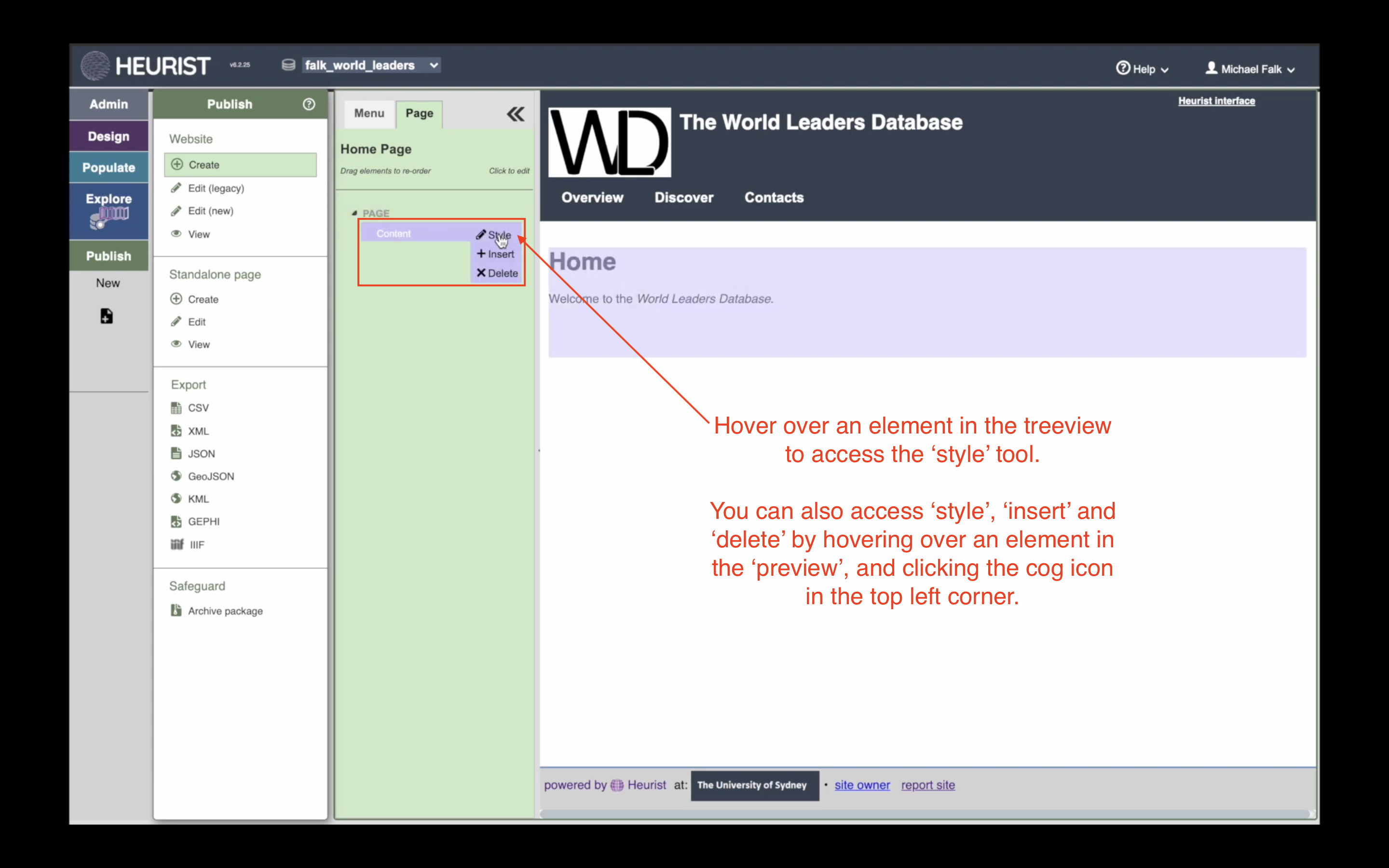
Style an Individual Element
You can change the formatting of an individual element by hovering over it in the treeview and clicking ‘style’. (‘Style’ is webspeak for the appearance of webpages.)
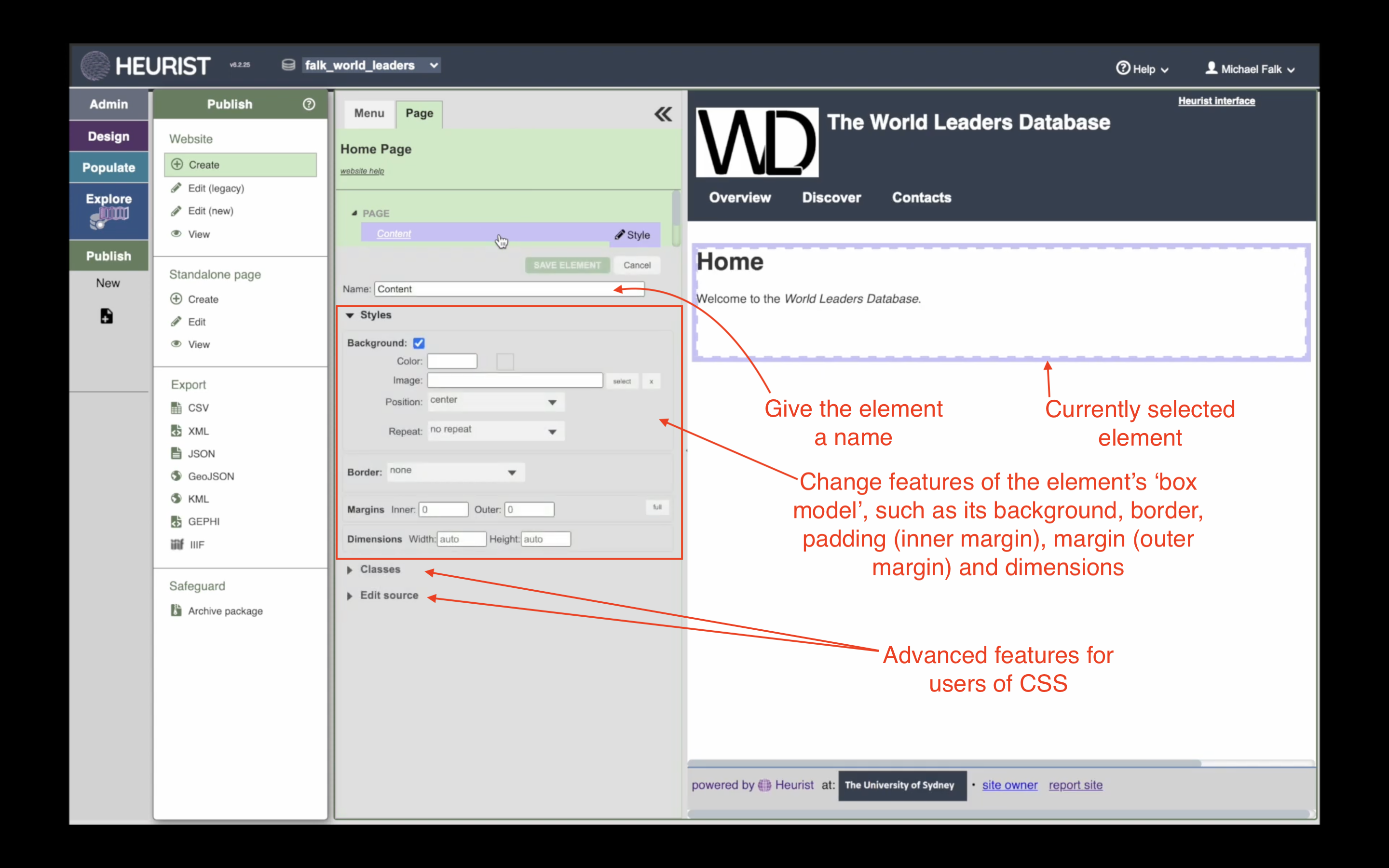
In the style tool, you can adjust aspects of the element’s ‘box model’ directly onscreen. You can set a background color, the margins and borders, and the size of the element. You can also give the element a name to make the ‘treeview’ of the page easier for you to read—the name has no impact on how the website appears to visitors.
The element you are currently working on is highlighted by an animated blue border. If you change the element in any way, the changes are immediately visible in the preview. You can therefore use Heurist’s web editor to experiment and learn by doing. You don’t need to know very much in advance about what these different settings do—just change them, and see the effect. You can actually learn a lot about web development just by playing with Heurist’s website builder. Anything you learn about your Heurist site will automatically apply to basically any website on the internet.
Advanced users can apply custom CSS classes to the element, or write incline CSS as they desire.
Insert a New Element
Inserting a new element is similar to accessing the style tool: simply hover over the place in the ‘treeview’ where you would like to insert the new element, and click ‘insert’. If you want to add a new ‘top-level’ element to the page, hover over ‘page’ in the treeview. If you would like to insert an element inside an existing element, then hover over the existing element and click ‘insert’. We will see an example of this in the final part of this tutorial.
In the video, I wish to add a ‘Text in 2 columns’ component to the page as a whole, so I hover over page and click ‘insert’:

When you click insert, you will be taken to our current library of available components. Many of these can be spliced together and combined, allow you to build up a complex page layout from basic parts. We are constantly updating the library of components to make them more useable, so you may see this list change as time passes. In the video example, I choose ‘Text in 2 columns’:
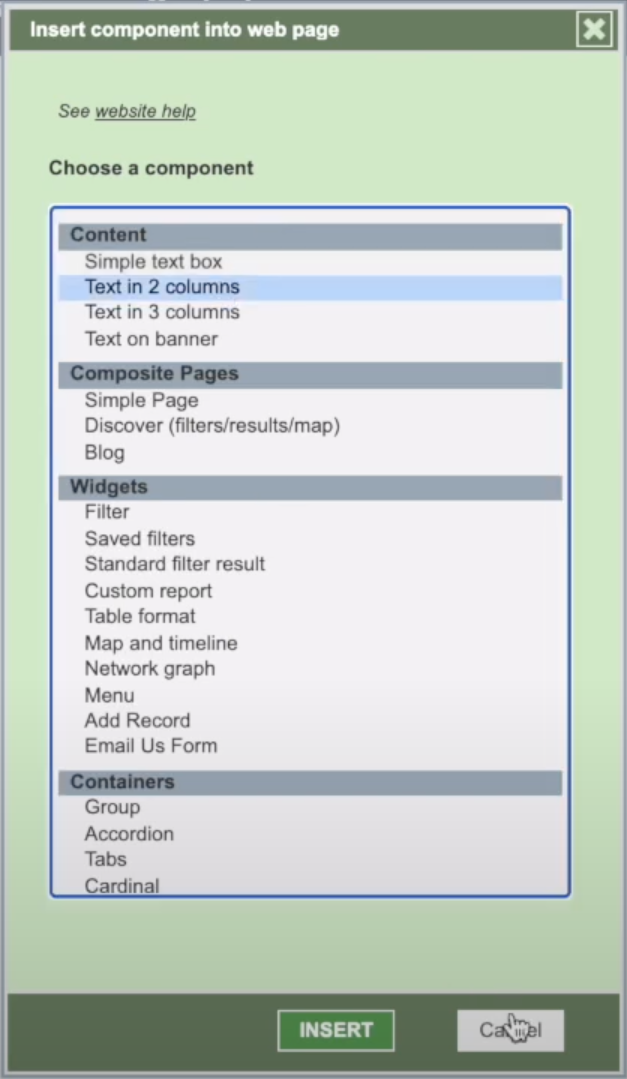
After inserting the component, you can edit its content in the usual way. You could also add further elements to change the component. Challenge: How would you turn this two-column layout into a three-column layout?

Element vs. Component
You may have noticed these two words cropping up throughout the tutorial. If you dive deeper into web development, you will see them cropping up everywhere on the internet. The two terms are often interchangeable in practice, but refer to slightly different things:
| Element | A basic building block of a page, defined by a particular ‘html tag’, e.g. a paragraph (<p></p>), image (<img></img>) or division (<div></div>). There are a fixed number of elements allowed in html. |
|---|---|
| Component | A particular element or set of elements that perform a particular function and can be reused. For example, the ‘Text in 2 columns’ component is made up of three ‘division’ elements: one division for each column, and a larger division that holds the two columns together. This larger division is sometimes called a ‘container’ element, though in reality it is exactly the same type of element as the two columns. When you insert the ‘Text in 2 columns’ component into your page, all three of these elements are inserted in the correct way, with some default ‘styling’ to make sure that the larger division behaves as a ‘container’ and the two smaller divisions behave as ‘columns’. |
If you understand this, then you can answer the challenge above. To turn a two-column layout into a three column layout, simply add another element inside the container. Hover over the container element (whose name is ‘2 Columns’ in the example), and click ‘Insert’. ‘Simple text box’ is the most logical choice for your third column, though if you wanted your third column itself to be divided into two columns, you could add a ‘Text in 2 columns’ layout. Or perhaps you would like your third column to be an interactive widget—in which case, you should proceed to part three of the tutorial.
A quick introduction to flexbox
In this section of the tutorial, I suggest you use ‘flex layout’ to make your widgets appear neatly on screen. ‘Flex layout’ is one of the four main layout patterns on the web, along with ‘inline layout’, ‘block layout’ and ‘grid layout’. If you are going to spend time building webpages, it is really worth your while understanding the basics of what ‘flex layout’ does. In order of difficulty, here are three resources I recommend you check out:
- I know nothing! CSS Flexbox in 100 Seconds, courtesy of Fireship.io.
- I need some tips: A Complete Guide to Flexbox, at CSS-Tricks.com.
- I need the full documentation: flex reference, from MDN Web Docs
If you choose ‘flex layout’ for an element/box in your Heurist webpage, then all the items inside the element/box will be layed out according to the rules of flexbox. Heurist provides you tools for choosing attributes such as the ‘main axis alignment’ and ‘cross axis alignment’ without needing to type any CSS code.
Create a Page to ‘Explore the Database’
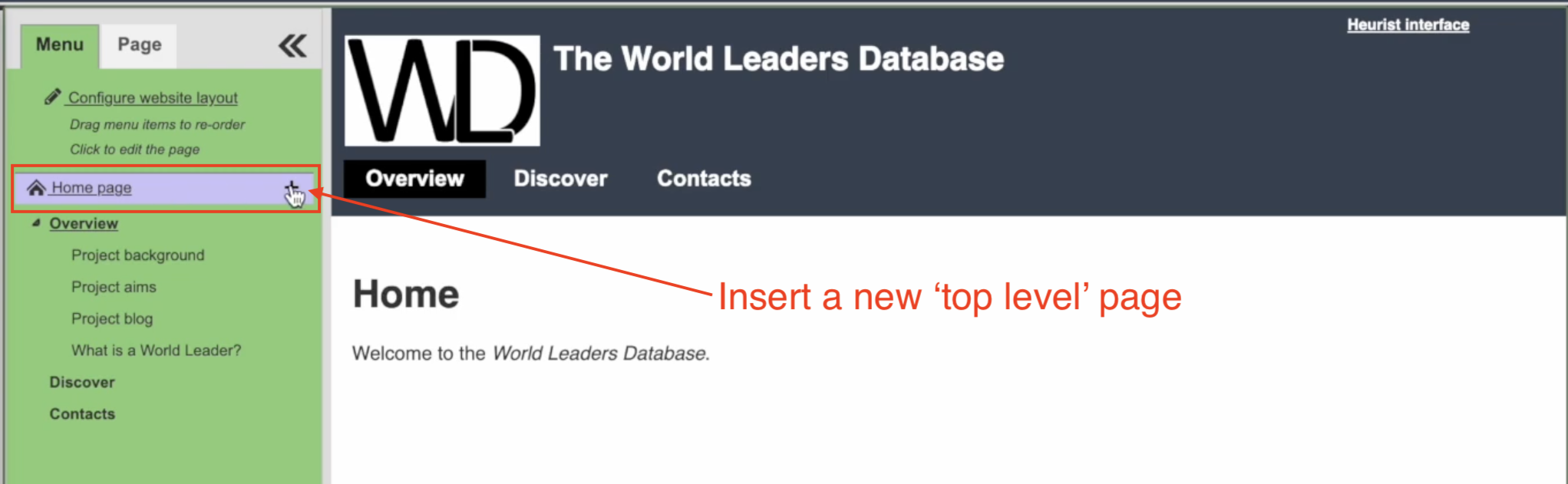
For the sake of this tutorial, I show you how to create a new page to allow visitors to explore your database. In fact, we already provide a template for this kind of page. You will see that every new Heurist site comes with a ‘Discover’ page that allows visitors to search the site, see a list of results, and also visualise the results on a map/timeline. As you develop your site, however, you will likely want to have multiple discover pages, each of which is formatted precisely for the needs of your project. Thus in this exercise, we will create a new ‘Explore the Database’ page from scratch.
In the first part of the tutorial, I created a new page for ‘What is a World Leader?’ which was nested under ‘Overview’. For this exercise, I instead create a ‘top level page’ which will have its own button in the website menu. To do this, hover next to ‘Home Page’ in the website treeview and click the ‘+’ icon:
Insert ‘Group’ Component as container for the widgets
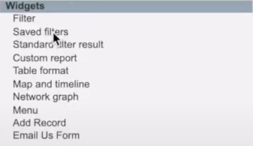
Now we have a new page, we need somewhere to put the widgets we would like to use. We are going to use two widgets for this page:
- Saved Filters: This widget allows you to put a filter you have predefined in the Explore menu onto your website. For a public website, the best kind of filter to use is generally a ‘faceted search’, and that’s what I do in this video. A ‘faceted search’ is a customised search box created by you. You decide which type of record you would like people to be able to search (e.g. Persons), and then choose which fields you would like people to be able to use for the search (e.g. Family Name(s), Age, Occupation). Heurist will generate a search interface for you, and you have lots of control over how the search interface looks and behaves. Read the help page on the ‘facets builder’ for more details.
- Map and Timeline: This widget collects whatever results are produced by other widgets on the page, and displays them on an interactive map with a timeline underneath. Of course, this means it can only display records that have some spatial or temporal data associated with them. Most users are happy to let the Map and Timeline widget use its default settings, so normally there is very little you need to do to make this widget work as you desire.
Since we have two widgets that interact with one another we would ideally like to put them side-by-side. The visitor to the site will type some search terms into the faceted search to the left, and the results will automatically appear on the map and timeline to the right.
We could create this layout using to the ‘Text in 2 Columns’ layout I introduced in part 2 of the tutorial, but for the sake of learning, here I show you a different method. We are going to insert a generalised ‘Group’ component as the container for our widgets, and then adjust some of its settings so it lays the widgets out next to one another.
First insert the ‘Group’ component as a top-level component of the page. ‘Group’ is the first option under ‘Containers’ in the library of components you can insert:
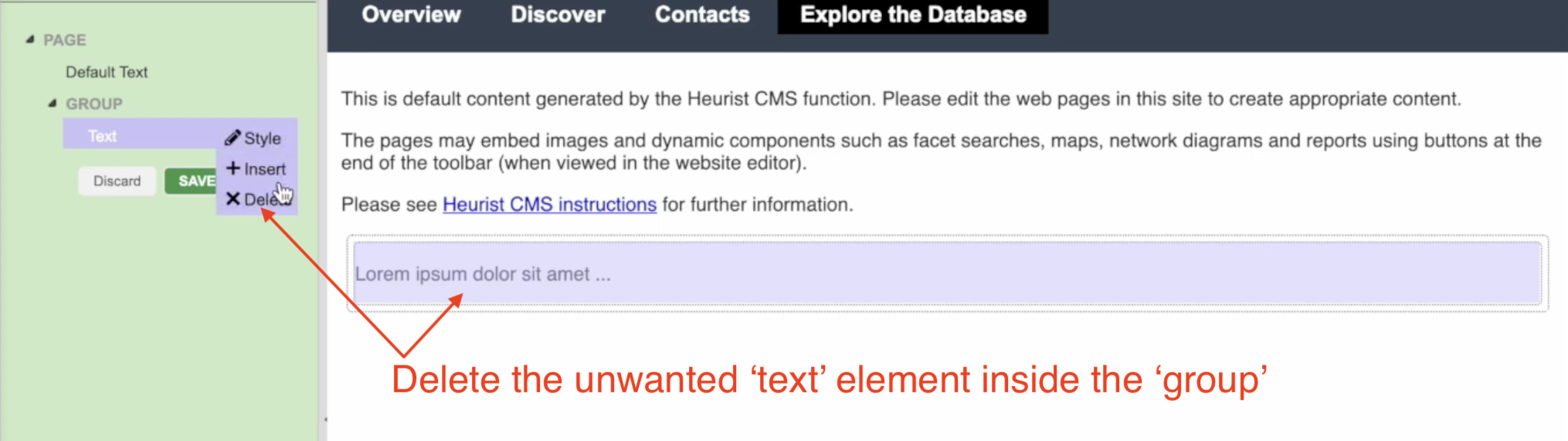
The Group component includes a ‘Text’ component inside it by default. Since I don’t need this element, I delete it from the webpage:
Add the Widgets to the ‘Group’ Container
Now I have the ‘Group’ element on the page, I add my two widgets.
The Saved Filters Widget
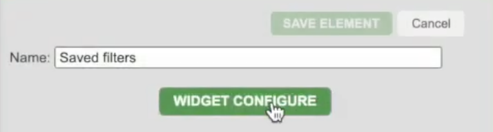
First I add the ‘Saved Filters’ widget to the ‘Group’:
Now I need to configure the ‘Saved Filters’ widget to tell it which filter(s) I want it to use. To access the widget settings, I go to the ‘style’ tool for the element. In Part 2 of the Tutorial, I showed you how to access the ‘style’ tool from the treeview. You can also access it from the preview, by hovering over an element and clicking the cog in the top left:

In the style tool, there is a button for ‘widget configure’, which allows me to control the behavious of the widget:
In this case, I have already predefined a particular ‘faceted search’ that I would like to use for this page. So I click the button to ‘Choose specific filters’, and select ‘World Leaders Facet’ from the list of available filters:
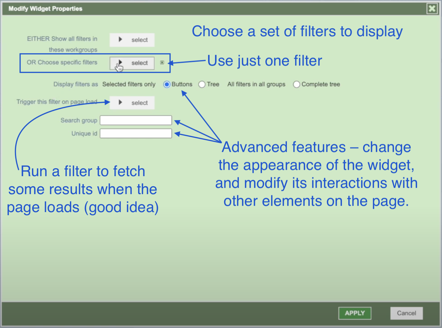
After clicking ‘Apply’ and ‘Save’, the Saved Filters widget is ready to use. Now I just need some other widget on the page to display the results of the search.
The Map and Timeline Widget
To insert the Map and Timeline widget, I follow exactly the same steps as before. I click the ‘+’ icon next to ‘Group’ to insert the widget inside the Group element. Then I choose ‘Map and Timeline’ from the list. In this case, there is no need to configure the widget, as the default settings are perfectly appropriate.
Improving the Layout
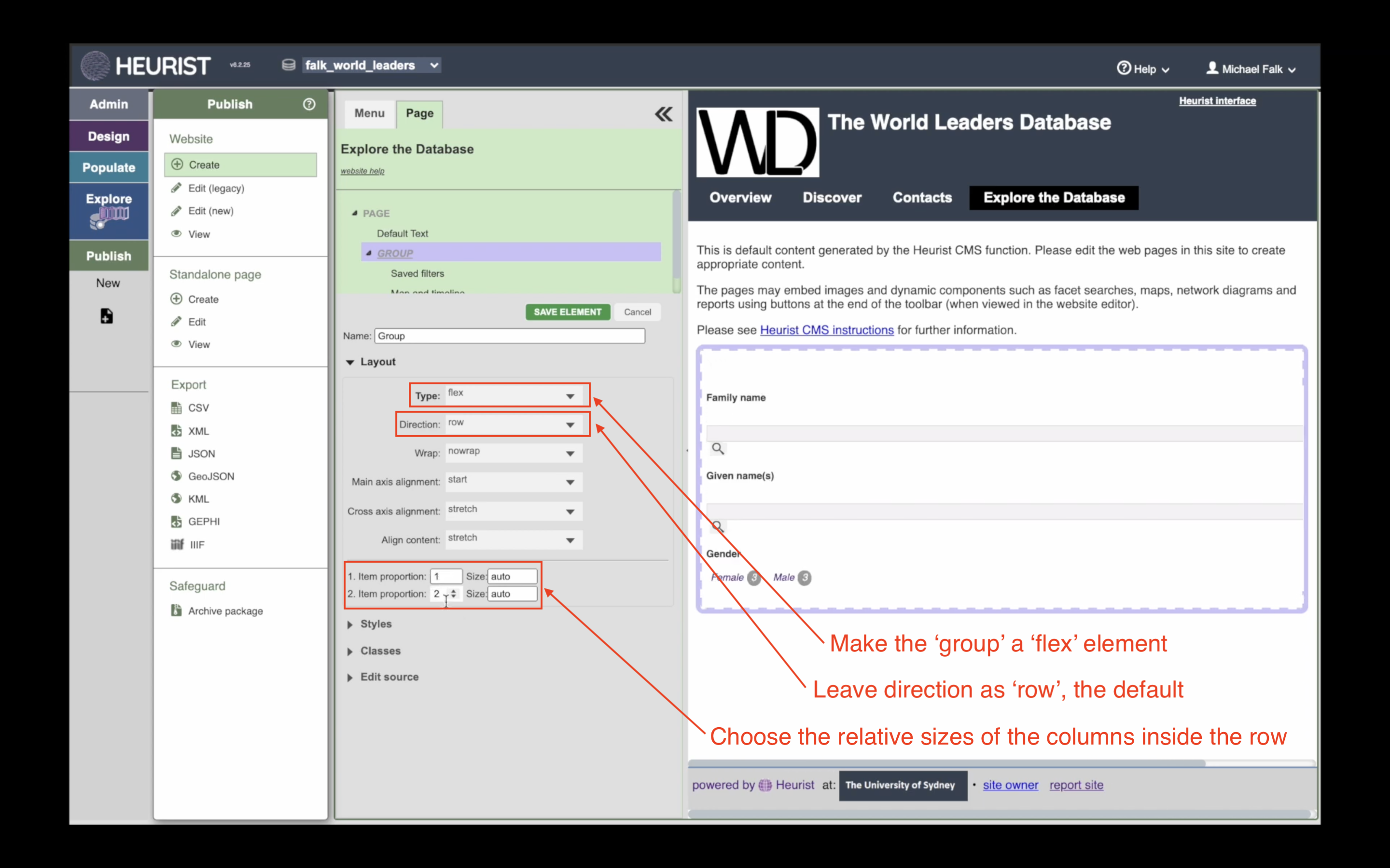
After inserting the Map and Timeline, there is a problem. The Map is invisible! There is a technical underlying reason for this, which is not so important. But basically the problem is that the Map and Timeline is being squashed by the Saved Filters. To fix this problem, we need to adjust the settings for the ‘Group’ element so that it allocates the right amount of space to each element inside it.
The best way to do this is to turn the ‘Group’ element into a flexbox (see above). If we turn it into a flexbox, then we can easily control the size and orientation of the items inside it.
To do this, open the style tool on the Group element, and change Layout: Simple to Layout: Flex.* Then choose the following settings:
- Direction: Row (the default option). This probably seems wrong! Don’t we want the group to have two columns? But this is exactly why the group should be a row. We want the group of items to run from left to right, so that each item inside the group becomes a column. If we set the group to be a column, then the widgets would run from the top of the page to the bottom.
- 1. Item proportion: 1. This says to allocate ‘1 part’ of the ‘group’ flexbox to the first item inside it. The first item is the ‘Saved filters’ widget.
- 2. Item proportion: 2. This says to allocate ‘2 parts’ of the ‘group’ flexbox to the second item inside it. This second item is the ‘Map and Timeline’ widget.
As you can see, the ‘item proportion’ attribute works a bit like a recipe. To make porridge, you add ‘1 part oats to every 2 parts milk’. Likewise, to allocate space inside this group, we allocate ‘1 part of item 1 to every 2 parts of item 2’, meaning that item 2 will be twice as wide as item one.
Taken together, these settings tell the computer to lay out the group sideways as a row, allocating 1/3 of the space to the first column and 2/3 of the space to the second column. To get a feeling for what the other settings, such as ‘wrap’ and ‘cross axis alignment’ do, check out the resources at the top of this section, or add some more elements to the ‘group’ and play around with the settings to see what happens.
Once you have set up the ‘flex’ layout of the group, you should see the complete page below. Heurist does a lot of the hard work for you, and automatically links the two widgets together. Simply type a query into the ‘faceted search’, and the map should automatically update.

*For html/CSS users: this changes the ‘display’ property of the ‘div’ from ‘block’ to ‘flex’.
Next Tutorial: The Admin Menu
Our Tutorials
Do you need help with something else? Contact Us, and let us know what additional tutorials you think we should provide.
