The latest version of Heurist has significant improvements in the mapping and timeline functions:
- Automatic derivation of map location for non-geo-localised entities from connected Places
- Improved map marker clustering
- Improved temporal filtering
- Map selection tools
Derive Map Location
This feature displays the mapped locations of any records which are linked to Place records or selected other record types with geospatial fields. It has always been possible to map locations using Rules to pull in connected records containing coordinates, but that slightly obscure function has now been automated, and improves on the existing function by associating the coordinates directly with the records in the subset and mapping the records with their record icons rather than just a place marker.
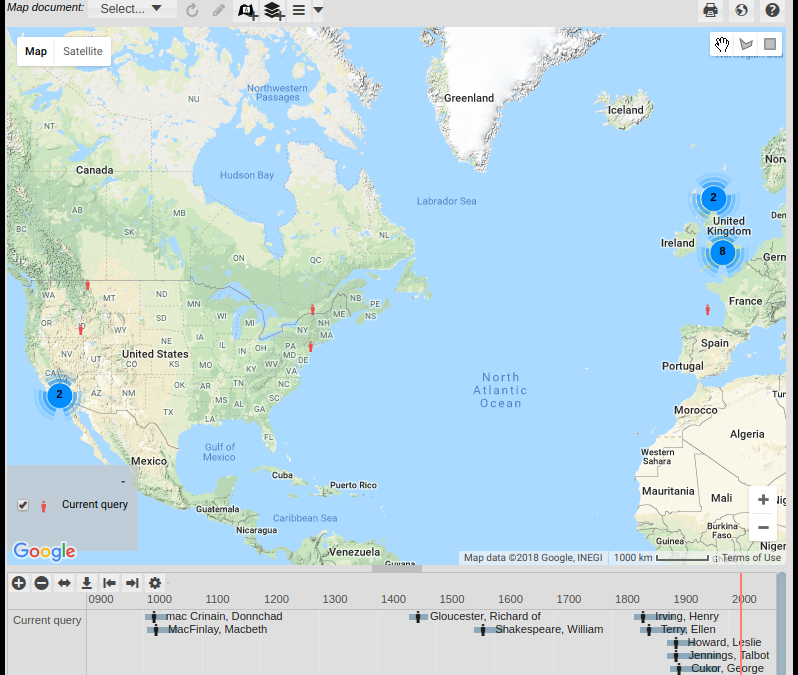
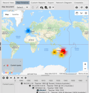
This feature is a wonderful simplification and a functionality I personally have often wished for when working in my Heurist databases. It is displayed in the image above. Person records point to Place records (e.g. for Place of Birth or Place of Death), but often do not actually have geospatial fields themselves. The screenshot above shows Person records from a database on Shakespeare’s Plays. A Place of Birth (and occasionally a Place of Death) is recorded for each of these Person records.
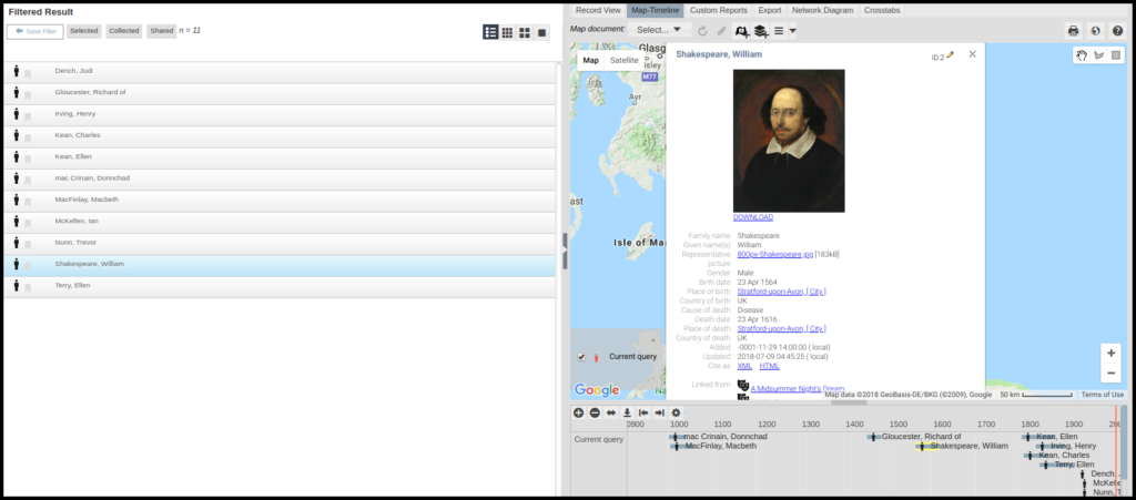
Thus, although these Person records do not actually contain a geospatial field (but rather pointer fields to Place records), the Derive Map Location function allows these Person records to be displayed on the map, as well as the timeline. Clicking on any of the person icons will select the associated record and open a popup of the record details (see screenshot below). Note that this function is enabled by default for all new databases, but must be switched on for existing databases.
This is extremely useful for records where optimal database design means that the geospatial information is in a linked record (this is often the case, since many records will link to a smaller set of Places, and the coordinates of those places should not be duplicated in many individual records). A good example is the Occupation eventlet in a database such as Expert Nation (expertnation.org) which records a period of employment for an individual with dates and location specified by Place (since many people will have worked at the same place, it causes unnecessary and undesirable redundancy to record the coordinates of every instance of employment). The new function allows the employment instances themselves to be mapped, so that the map can be filtered by the timeline, and clicking on the map objects will pop up details of the employment instance rather than the place.
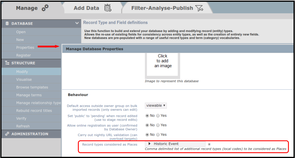
Note that this function only works by default for records linked specifically to the core Heurist record type, Place. However, you can add additional record types which will be considered as Places for mapping purposes (ie. whose coordinates become available for mapping of records which connect to them). This is set in the Manage tab under Properties:
Map marker clustering
This feature has long been available in Heurist, but was OFF by default (it can be turned on under Preferences). It is now ON by default for new databases, and has been improved through better handling of multiple records at an identical location (meaning that the cluster cannot be zoomed in further to separate the icons).
Where several records appear in close proximity on the map display, they are clustered and replaced with a number representing the number of records within the cluster. This provides a clearer and more attractive map and more information than a dense cluster of overlapping icons. In the map below we see the distribution of instances of employment as teachers for Australian university staff and students involved in WWI – we immediately grasp the nature of the distribution:
Clicking on one of these clusters immediately zooms the map to extent of the cluster so that it separates out the individual icons (it may then show smaller clusters within the extent). If all the records in a cluster are at exactly the same location, instead of zooming to the cluster – which would not server to separate the icons – the information popup is displayed, with a list of all the records at that location; clicking on one of these displays the information for that record in the popup.
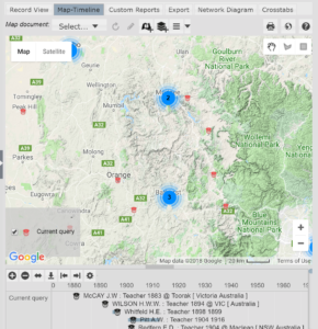
This is a great feature and saves heaps of time otherwise spent zooming in and out trying to see which records are where. In the map below, of instances of employment as teachers, I have clicked repeatedly on clusters to zoom in to an area – some clusters are still displayed because there are several instances at specific schools:
I love this feature and think it well worth enabling via the Preferences dialogue box, which is why we have now defaulted it to be ON. It is a really useful feature for any records which have mapped locations, and it is a great complement to the other two new features, especially the “derive map location” feature.
Map select tools
The selection tools can be seen in the top right of the screenshots above. These tools allow one to select records on the map in different ways. Most notably, one can now select records interactively on the map using a rectangle or self-defined polygon. The latter is really useful for investigating clusters of records, as identified by the Map clustering tool, described above. Once the polygon is defined, the map automatically zooms into and selects those records within the polygon. The first record, determined alphabetically, has its information displayed in a popup, as shown above, and in the bottom left corner of the popup is a dropdown menu showing all the selected records, allowing one to quickly navigate to any of the records in the selected set.
Filter by timeline
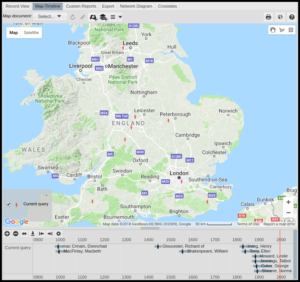
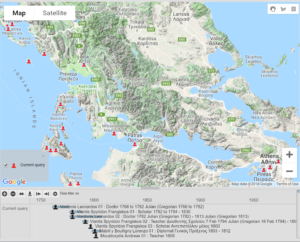
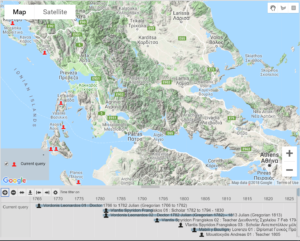
This feature has been re-implemented and switched on by default for new databases. It interactively filters the map display to display only those records within the current timeline display; the map display updates immediately as the timeline is zoomed or scrolled. The two images shown below shows how the display on the map changes as one scrolls along the timeline.
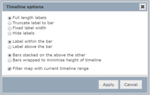
This feature is now activated directly through a checbox on the timeline options dialogue (below), opened by the gearwheel symbol above the timeline. Other options cover how records and their labels are displayed on the timeline. The “Filter map with current timeline range” option has great potential for showing changes through time, especially for map-timeline feeds to websites.
These new features complement each other very well and can work together to improve one’s ability to interact with the map and timeline. For example, one can show the changing distribution through space and time of a particular record type, such as a Person, a person’s life events such as employment or military service, or a Museum Object, even though those records do not themselves have geospatial fields, their location(s) being represented through pointers to Place records. The map is also made more legible by clustering, which now handles clusters of records which cannot be spatially differentiated (ie. they all occur at exactly the same Place).

